ADA WEB COMPLIANCE GUIDE
make accessibility the standard across your entire site
Inaccessible websites quietly block customers every day. People can’t navigate menus, forms fail, videos lack captions—and they leave. That’s lost trust, lower conversions, and increased ADA risk.
This guide turns WCAG 2.2 AA into practical steps your team can ship now: focused audits, prioritized fixes, and sustainable governance.
Stick with it and you’ll build an inclusive site that’s easier to use, easier to maintain, and legally safer. You’ll know what to do first and how to keep improving.
Experts

Business Strategist

Strategy Lead
what ADA website compliance means
The Americans with Disabilities Act (ADA) is a U.S. civil rights law that prohibits discrimination and requires accessible experiences.
The Department of Justice has long held that many websites—especially those operated by businesses open to the public and state/local governments—must be accessible to people with disabilities.
If you offer information or services online, you should make them work for everyone.
On the implementation side, teams rely on the Web Content Accessibility Guidelines (WCAG), developed by the W3C, to define what “accessible” looks like in practice.
The current recommendation is WCAG 2.2, and most organizations aim for Level AA conformance. WCAG 2.2 builds on earlier versions; if you meet 2.2, you also meet 2.1 and 2.0.
Key idea: ADA sets the obligation; WCAG provides the technical playbook.
Why care right now: Accessibility is the right thing to do—and it’s good business. You’ll reach more customers, reduce friction, and reflect your brand values. We also believe the content you publish is just as critical as code—more on that below.
For more background, see our article What is an ADA-compliant website?
ADA vs. WCAG: how the law and the standard work together
Think of the ADA as the law that says everyone must be able to use your website, and the DOJ as the ref reminding you that accessibility is part of “effective communication.”
The ADA doesn’t name a single web spec in the statute—that’s normal for laws—but it does make accessibility required for state/local governments (Title II) and most businesses open to the public (Title III).
In short, the obligation is clear, even if the law doesn’t read like a tech manual.
Now meet WCAG 2.2—the technical playbook most teams use to fulfill that obligation. It’s a W3C Recommendation and the most-cited standard for web accessibility.
Practically, aiming for WCAG 2.2 AA gives designers, developers, and content creators a shared checklist.
As a bonus: if you meet 2.2, you also meet 2.1 and 2.0—so you’re covering the earlier bases, too.
Here’s what you need to do: set your policy and intent around the ADA, then run your day-to-day work against WCAG 2.2 AA.
That pairing keeps you aligned with the law and focused on the concrete fixes users feel. Guidance pages can change over time, so loop in legal counsel for your specific risk posture.
why accessibility matters
Accessibility touches more people than you might think. In the U.S., more than one in four adults—over 70 million people—report a disability. That includes vision, hearing, motor, cognitive, and other conditions that can affect how someone uses your site.
This isn’t a niche audience; it’s your audience. When your site is accessible, more people can do what they came to do—no detours, no dead ends.
And it’s not only permanent disabilities. Think about a broken wrist (temporary) or trying to fill out a form while holding a sleeping baby (situational). The same design choices that help someone with limited mobility—larger targets, clear focus, alternatives to dragging—also help the parent juggling a cup of coffee and a phone. Designing for the edges improves the experience for everyone.
Accessibility also makes everyday UX better. Captions help Deaf and hard-of-hearing users—and anyone watching a video in a noisy space.
Clear labels and instructions help users with cognitive disabilities—and anyone who’s tired, rushed, or multitasking. These improvements are simply good product thinking that pays off for all visitors.
To truly have a compliant website, it requires a commitment to ensuring your content is accessible to all. That’s the heart of it.
Accessibility isn’t just code; it’s a shared responsibility across design, development, and content—every page, every release.
reach more of your real audience
When barriers come down, more people finish what they came to do. In the U.S., more than 1 in 4 adults—over 70 million—report a disability, so accessibility isn’t a niche play; it’s how you serve your actual market.
Prioritize inclusive patterns and you’ll see drop-offs shrink in the spots that used to be brittle.
make performance feel effortless for everyone
Clear structure, readable type, and well-labeled forms help every visitor move faster—whether they use a screen reader, a keyboard, or just had a long day.
These upgrades map to WCAG 2.2 AA and overlap heavily with rock-solid usability, which is why teams often see better engagement after accessibility work.
Use the WCAG quick reference as your day-to-day compass.
lower legal risk by showing clear good-faith effort
The Department of Justice has been explicit: websites for state/local governments and businesses open to the public should be accessible under the ADA.
The statute isn’t a tech manual, but aligning to WCAG and documenting remediation demonstrates you’re meeting your effective-communication duties—reducing the chance of complaints and costly distractions.
prove your values in the everyday experience
Inclusion is a brand value; accessibility is how you make it tangible.
An accessible site signals respect for every visitor and builds trust that marketing alone can’t buy—benefits the W3C calls out in the business case for digital accessibility. Over time, that trust compounds.
the WCAG 2.2 AA essentials (what changed and what to prioritize)
2.5.8 target size (Minimum) (AA)
Think of tiny tap targets like trying to press a doorbell with winter gloves on—possible, but annoying and error-prone.
WCAG 2.2 sets a baseline: interactive targets should be at least 24×24 CSS pixels, or have enough clear spacing so you don’t accidentally hit the neighbor.
Inline links in a paragraph and a few other cases are exceptions, but the spirit is simple—make controls easy to hit, especially on mobile.
If you can, go bigger; it helps everyone.
2.5.7 dragging movements (AA)
Dragging is a dexterity test: press, hold, move, release—four actions that not everyone can perform reliably.
This criterion says: don’t rely on drag-only interactions.
Provide a single-pointer alternative like click/tap to sort, arrow buttons to move cards, or a numeric input next to a slider.
The goal is the same result without forcing users to “click-and-hold.”
2.4.11 focus not obscured (Minimum) (AA)
Keyboard users track where they are with the focus indicator—like following a bouncing ball in karaoke.
If sticky headers, footers, or popovers cover that focused element entirely, navigation becomes guesswork.
WCAG 2.2 requires the focused item to stay at least partially visible; design modals and sticky elements so they don’t block the user’s “current position.” (Bonus: use CSS scroll-padding to help.)
3.3.8 accessible authentication (Minimum) (AA)
Logging in shouldn’t feel like solving a riddle while juggling.
Don’t force memory or transcription as the only path—allow password managers to fill fields, let users copy/paste codes, or offer more inclusive options like passkeys/WebAuthn.
Avoid CAPTCHAs that screen readers can’t access; if you must use a challenge, offer an equivalent that isn’t a cognitive test.
3.2.6 consistent help (A)
When someone needs help, they shouldn’t have to hunt for it on every page. If you provide support (chat, phone, FAQ, contact form), keep it in a consistent place and order across your site.
Familiar placement reduces cognitive load, especially during stressful tasks like checkout or applications. Consistency is the win here.
3.3.7 redundant entry (A)
Ever been asked to type your address twice for no reason? This criterion says don’t make users re-enter info in the same process—auto-populate or let them select it.
Fewer repeats mean fewer mistakes and less cognitive drain, which is especially helpful for longer forms.
There are reasonable exceptions (security, invalid data, or when re-entry is essential), but default to “enter once, reuse thoughtfully.”
why 2.2 is “additive” (and why that matters)
WCAG 2.2 builds on 2.1 and 2.0. If you meet WCAG 2.2 AA, you’ve effectively met the A/AA criteria from the earlier versions, too (with one noted change: 4.1.1 was removed from 2.2 but may still be required by some policies).
The W3C advises using the latest version to future-proof your work and your policy language.
how to check your site: audits, tools, and quick wins
A solid accessibility review mixes automated scans with human testing—like running diagnostics on a car, then taking it for a road test.
Scanners flag common patterns fast; people verify the real experience with a keyboard and screen reader. No automated tool can catch everything, so you need both to see the full picture.
scoping & sampling
Start by mapping your site’s building blocks—templates, components, and a few representative pages for each major flow (navigation, forms, checkout, etc.).
Full crawls are rarely practical, so choose samples that reflect how users actually move through the site.
The W3C’s WCAG-EM methodology and free Report Tool
can help you plan and document this work without reinventing the wheel.
automated scans
Next, run reputable scanners across your key pages. Think of this as turning on the shop lights: you’ll spot obvious issues like contrast failures, missing alt attributes, or ARIA misuse in minutes.
Use a couple of perspectives—e.g., axe DevTools and Chrome Lighthouse—and keep the W3C’s tools directory handy.
Treat results as a starting point, not the final word.
manual keyboard testing
Now put the mouse away and try common tasks using only the keyboard (Tab, Shift+Tab, Enter, Space, arrow keys).
Watch the focus indicator like you’d follow a cursor in class—if it disappears or gets trapped, you’ve found a blocker.
The W3C’s Easy Checks and WebAIM’s keyboard guides outline exactly what to look for, including visible focus and logical tab order.
This step catches many issues automation misses.
assistive tech checks (screen readers)
Listen to your site the way many users do. With NVDA (Windows) or VoiceOver (macOS/iOS), read a page and attempt a few tasks: navigate headings, activate buttons, fill a form.
You’ll quickly hear problems with missing labels, unhelpful announcements, or confusing structure—and you’ll confirm what’s truly fixed.
WebAIM’s VoiceOver primer and Apple’s VoiceOver guide are great quick starts.
issue clustering (fix once, benefit everywhere)
Group findings by component or template—for example, “primary nav,” “modal,” “form field,” “carousel.”
This avoids whack-a-mole fixes and turns one code change into site-wide improvement.
WCAG-EM’s approach of scoping + sampling + structured reporting supports this “fix once, scale everywhere” mindset.
remediation plan (prioritize impact)
Not every issue is equal. Score each by user impact and effort, assign owners, and set realistic timelines so the highest-impact fixes ship first.
The W3C’s conformance evaluation resources can help you capture results in a clear report your team (and leadership) will understand.
quick wins you can ship fast
- Alt text & decorative images. Write alt text that explains purpose; mark purely decorative images so screen readers skip them. Use the W3C’s Alt Text Decision Tree when you’re unsure.
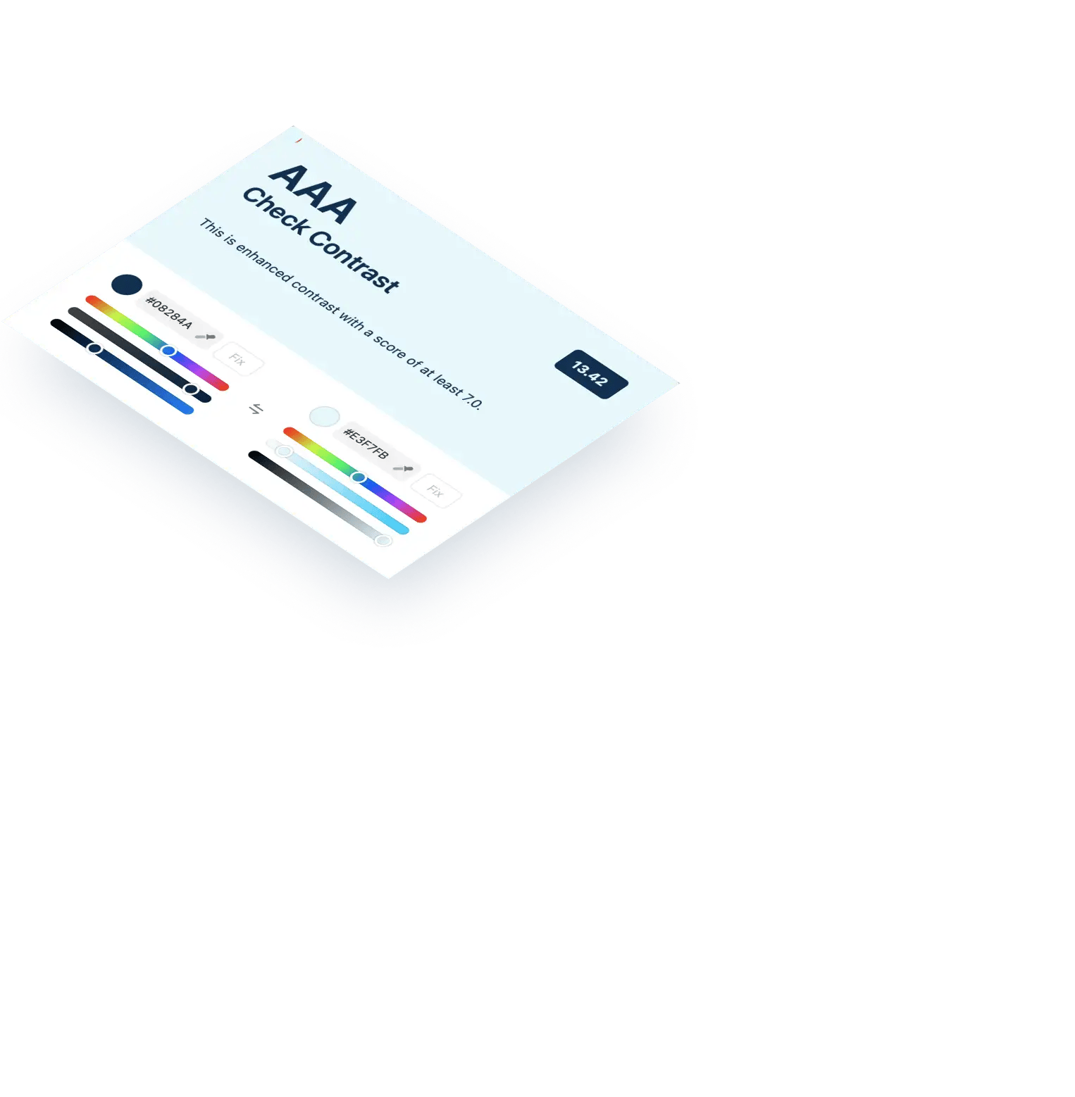
- Color contrast. Verify text and UI contrast with WebAIM’s Contrast Checker (Lighthouse and axe also flag this). Fixing contrast often improves overall readability.
- Forms & errors. Make sure every input has a programmatic label, errors are announced next to the field, and help text is clear. (Keyboard-only testing will expose gaps fast.)
- Focus & traps. Keep focus visible and make sure modals/menus don’t trap it. If users lose their place, they’ll bail.
- Descriptive links. Replace vague “learn more” links with text that says where it goes or what it does. This helps everyone—especially screen reader users.
- Captions & transcripts. Caption videos and provide transcripts for audio; it’s essential for Deaf and hard-of-hearing users and great for anyone in a noisy space.
For more starter steps, keep the W3C Easy Checks and WCAG 2.2 Quick Reference open while you work. They’re the perfect companions for iterative improvements.
design and development best practices
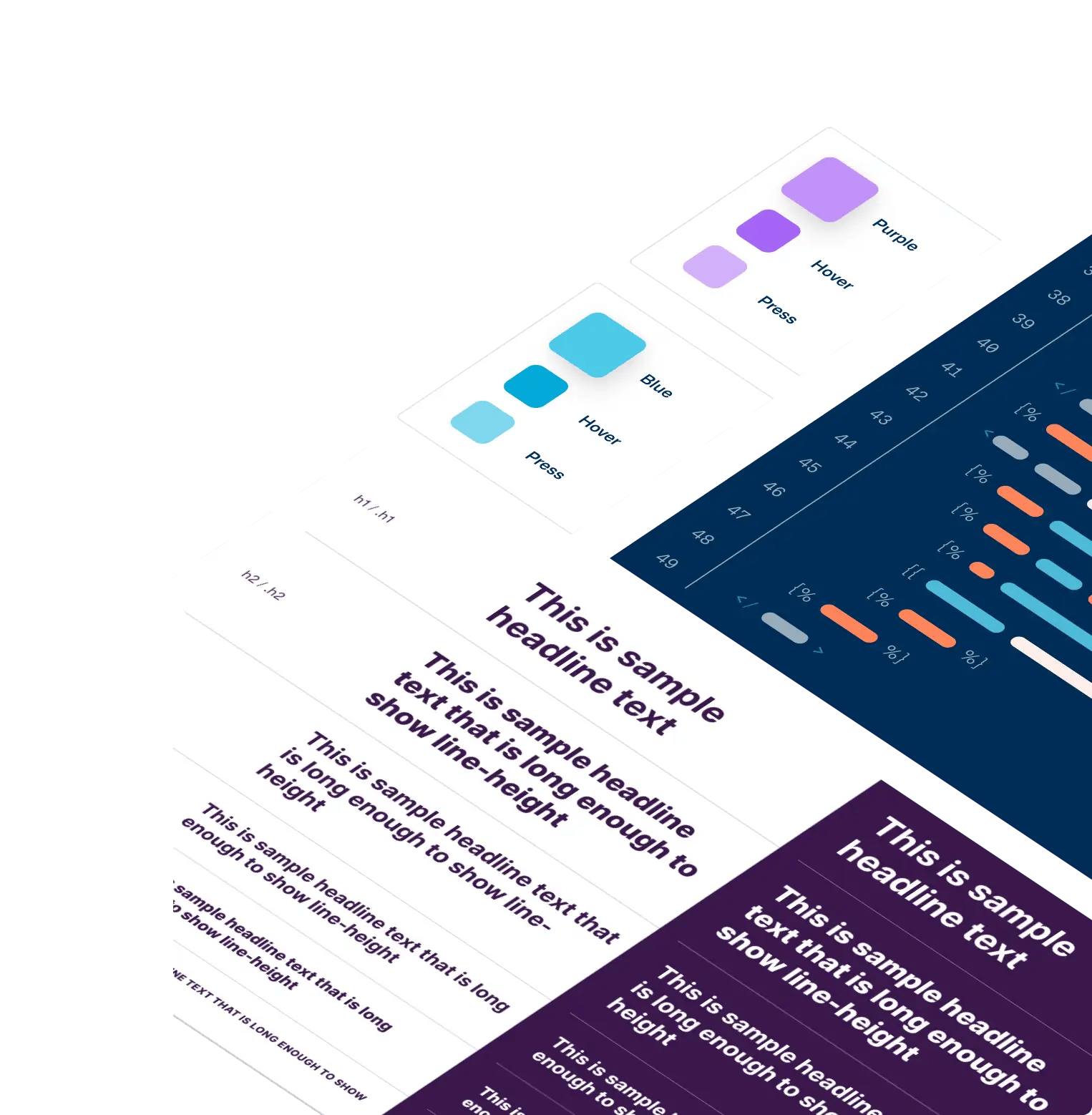
design system & tokens
Bake accessibility into the system so “accessible” is the default, not a fire drill. Set up color tokens that already meet contrast thresholds and make those the only approved choices in design files and code.
That way, designers and engineers move faster with fewer late-stage fixes. If you use design tokens, document how they map to WCAG requirements so choices stay consistent as the system evolves.
type scale that holds up at zoom
Create a predictable type scale so hierarchy stays clear at 200–400% zoom.
When headings, subheads, and body text scale harmoniously, people don’t lose their place—and layouts are less likely to break.
This is one of those improvements that helps everyone, not just screen magnifier users. Keep an eye on line length and spacing while you’re at it.
spacing & target sizes (2.2-aware)
Small tap targets are like trying to hit a doorbell with winter gloves. It’s possible, but very frustrating.
Aim for the WCAG 2.2 “Target size (Minimum)” baseline and give controls enough breathing room to avoid mis-taps, especially on mobile.
Bigger targets and consistent spacing make the interface calmer and more forgiving. When in doubt, size up.
navigation & page structure
Use proper landmarks (header, main, nav, footer, aside) so assistive tech can jump straight to the right region.
Keep a logical H1 → H2 → H3 heading structure that mirrors your content—not your styles.
Well-structured pages reduce cognitive load for everyone and make screen reader navigation far more efficient. It’s the foundation that every other fix stands on.
skip links & keyboard-friendly patterns
Add a visible “Skip to main content” link so keyboard and screen reader users can bypass repetitive nav quickly.
Then verify that every interactive element works by keyboard alone with a clear, visible focus indicator and a sensible tab order.
If users lose focus or get stuck, they’ll bail—fast. Keep WAI’s “Easy Checks” handy when you review.
label modals clearly and announce intent
Treat modals like temporary mini-apps: trap focus inside, label them properly, and return focus to the trigger when they close.
Use the ARIA Authoring Practices modal pattern so screen readers announce the title and purpose.
A well-behaved dialog prevents “Where am I?” moments and keeps people moving. Test it with only a keyboard to be sure.
tame carousels with controls, not motion
Carousels are notorious for motion and focus problems.
If you keep one, avoid auto-advance or give obvious pause/prev/next controls that work by keyboard and are announced clearly to screen readers.
Make slide changes predictable and don’t hijack focus. Simpler is usually better here.
build forms that help, not hinder
Every field needs a programmatic label (not just placeholder text), and errors should appear next to the field they belong to—announced to assistive tech.
Provide helpful instructions and consider autocomplete where it makes sense. These small choices reduce mistakes and speed up completion for everyone. Run through your forms using only the keyboard to catch gaps.
make card grids meaningful to screen readers
Don’t rely on visual styling alone to imply structure. Use real lists, headings, and regions so screen readers understand relationships the same way sighted users do.
This maps to WCAG’s “Info and Relationships” principle: code should reinforce the meaning you’re conveying with design. Your content—and your analytics—will thank you.
performance & semantics (native HTML first)
Default to native HTML elements before reaching for ARIA; they come with built-in semantics and keyboard support. If you must use ARIA, follow patterns carefully—bad ARIA can make things worse.
Keep DOM order aligned with visual order so keyboard navigation follows what people see. It’s simple, and it works.
mobile realities: spacing, sticky UI, and orientation
On mobile, generous spacing and target sizes prevent accidental taps, and sticky elements must never hide focused controls.
Don’t lock the interface to a single orientation unless it’s essential for the task; let people use the device the way they prefer.
These changes reduce friction for everyone and align with WCAG’s guidance.
engineering workflow (tests, scans, and CI)
Add lightweight accessibility checks where they create signal without noise: linting rules, unit tests for key components, and automated scans in your CI to catch regressions early.
Combine different tools (e.g., axe + Lighthouse) because each finds different things. Then validate fixes with quick keyboard and screen reader spot-checks before shipping. Treat accessibility like any other quality gate.
content accessibility (where teams slip most)
Great design and clean code can still be undone by one inaccessible asset—like a gorgeous storefront with a locked door.
Content is the long game: every page, PDF, image, and video needs to pull its weight so people can actually use what you publish.
Treat this section as your day-to-day checklist for keeping the door open to everyone.
write for clarity
Lead with the point, then add detail—like a teacher previewing the lesson before diving in.
Use plain language, short paragraphs, and front-loaded sentences so busy readers (and screen readers) can scan and understand the “what” and “why” quickly.
Clarity helps everyone, and it aligns with accessibility best practices for content authors. The W3C’s tips for writers are a great quick read to align your team.
use descriptive headings and link text
Headings are your page’s signposts; they create structure for sighted readers and a navigation map for screen-reader users.
Keep a logical outline (H1 → H2 → H3) that mirrors your content, not your visual styles.
For links, say where the click goes—“Download the annual report (PDF)” beats “Learn more” every time. These habits reduce guesswork and help people move confidently.
images: write purpose-first alt text
Alt text should describe the purpose of an image in context, not every pixel.
If the image is purely decorative, mark it so assistive tech can skip it; if it’s functional (like an icon button), the alt should describe the action.
For charts and other complex visuals, give a short alt plus a longer text alternative (or a data table) that conveys the same information.
media: captions, transcripts, and descriptions
Video and audio need text equivalents so people can access them anywhere—no sound, no problem.
Provide captions for video and transcripts for audio; for visuals essential to understanding, add audio description (describes what’s on screen).
Choose media players that support keyboard access and expose controls to assistive tech. W3C’s media guides make it easy to plan what each asset needs.
documents (PDFs and presentations)
If you can, publish content as accessible HTML—it’s easier to maintain and works better across devices.
If a PDF is truly needed, start with a well-structured source file, export correctly, then tag and check reading order, headings, alt text, and forms before you upload.
Repairing a broken PDF later is far harder than building it right once. WebAIM and W3C’s PDF techniques are solid references for teams.
tables and data
Tables should clarify relationships, not hide them. Use header cells, captions, and summaries so people (and assistive tech) understand how the data connects.
Avoid merged cells and layout tables that confuse reading order; if a table gets too complex, consider a simpler layout or a supporting dataset.
WebAIM’s data-table guide and W3C’s tutorial cover the patterns that work.
governance: keeping sites accessible over time
make accessibility a team sport
Accessibility sticks when roles are clear and shared. Appoint an executive sponsor to remove roadblocks and a day-to-day owner (often product or marketing) to keep the work moving.
Then map responsibilities across UX, dev, and content so nothing falls through the cracks—and include people with disabilities in research and testing for real-world feedback.
The W3C’s Accessibility Roles and Responsibilities Mapping (ARRM) and guidance on involving users make this straightforward.
build it into your process
Treat accessibility like safety on a job site: it’s part of every step, not a final inspection.
Add criteria to design reviews and PRDs, and update your Definition of Done to include checks for contrast, keyboard flows, labels, and error handling.
Use WCAG-EM (the W3C evaluation methodology) to scope, sample, and document what you test—useful for audits and for showing progress to leadership.
The W3C “Planning & Policies” hub has templates to help you embed this across projects.
put tools and feedback loops in place
Schedule automated scans to catch obvious issues before they pile up, then follow up with manual checks (keyboard + screen reader) so real-world problems don’t slip through.
Keep a short list of vetted tools from the W3C evaluation tools list, and remember: automation is a head start, not the finish line.
Publish an Accessibility Statement with a simple way for users to report problems—and close the loop when they do.
train and refresh regularly
New teammates join, patterns change, and content evolves—training keeps quality from drifting.
Start with W3C’s free Digital Accessibility Foundations course or the WAI Curricula and build role-specific refreshers for designers, writers, and developers.
Even a quarterly lunch-and-learn paired with a short “top issues we’re seeing” update can prevent regressions. WAI’s resources for trainers make it easy to assemble lightweight sessions.
your options: fix, retrofit, or redesign on HubSpot CMS
fix (targeted remediation)
Think of this as patching the potholes on your busiest roads before the morning commute.
If your site’s foundation is solid, tackle the highest-impact issues in core templates and content first—forms, navigation, checkout, lead gen.
You’ll reduce friction fast and show measurable progress while you plan deeper improvements. Use WCAG 2.2 AA as the bar so fixes align with today’s standard.
retrofit (component/system updates)
When problems repeat across the site, renovate the “shared parts” instead of chasing one-off pages.
Refactor components like navigation, forms, modals, and carousels so each improvement scales everywhere that component appears.
It’s like upgrading wiring in the whole house—you touch it once, every room benefits. This approach pairs well with platform guardrails (e.g., modules and themes) so future pages inherit the fixes.
redesign (accessibility-first on HubSpot CMS)
If the foundation is shaky—outdated patterns, inconsistent code, hard-to-maintain content—it’s usually faster to rebuild with an accessibility-first design system.
On HubSpot CMS, accessible modules and themes let you codify WCAG-aligned patterns so marketers can ship pages quickly without re-introducing old issues.
Think of it as building a new house with better blueprints and materials: you get speed and quality. We recommend this when you need lasting guardrails, not one-off fixes.
proof (real-world example)
We’ve launched sites where accessibility was a core requirement—for example, National Cooperative Bank engaged us to deliver a WCAG-aligned experience on HubSpot CMS.
That project combined custom design with CMS patterns that support accessible structure and components. It’s a good snapshot of what an accessibility-first build looks like in practice.
media junction’s approach (audit → remediation → governance)
We’ve built and remediated accessible websites for years, and we believe the best path is clear, collaborative, and pragmatic.
1) accessibility audit & roadmap
We perform a WCAG 2.2 AA gap analysis across templates, components, and representative content. You’ll see where you stand and which issues matter most.
We pair automated scans with manual keyboard and screen reader testing. That blend catches both obvious violations and real-world usability problems.
We crawl pages to spot patterns and consolidate findings. Then we host a workshop to walk your team through the issues, options, and trade-offs.
Finally, we deliver a prioritized remediation plan with effort/impact scoring and named owners. You’ll know exactly what to do next and who’s on point.
2) remediation & redesign
We refactor components like navigation, forms, dialogs, and media players so they’re accessible by default. Fix once, benefit everywhere.
Our design team updates tokens and patterns for color, type, spacing, and motion so accessibility is baked into the system. We also enable your content team with better alt text, transcripts/captions, and a PDF remediation plan.
When a fresh start is smarter, we implement on HubSpot CMS with accessibility-first patterns. You get a modern site and a maintainable foundation.
3) governance & enablement
We help you publish an Accessibility Statement and set up a feedback channel. That public commitment creates accountability and trust.
We integrate editorial checklists right into your CMS workflow so creators do the right thing by default. Then we train marketers, designers, and developers so skills stick.
Ongoing monitoring—quarterly checks or a custom cadence—keeps quality from drifting. Accessibility becomes part of how you build, not a special project.
This mirrors our belief that accessibility spans UX, visual design, code, and content—not just one team’s to-do list.
what we covered—and what to do now
We’ve covered a lot: how the ADA sets the obligation, how WCAG 2.2 AA turns that into practical actions, and which updates matter most—clear structure, generous targets, visible focus, accessible forms, and content people can use anywhere.
You also saw how to test the right way (automation + human checks), fix issues at the component level so improvements scale, and use governance to keep quality steady over time.
This isn’t just compliance—it’s reach, performance, and brand trust.
That’s a lot to remember, and it’s okay to feel it. You can DIY many of these steps; the playbook is here. But like tuning a car, having an expert under the hood saves time, avoids rework, and catches the issues tools miss.
We’ll help you translate goals into a plan your team can actually ship—without slowing momentum.
Next step: let’s talk about your website and your accessibility goals. We’ll listen, review where you are, surface quick wins, and map an approach that fits your team—whether that’s targeted fixes, a component retrofit, or an accessibility-first redesign.
see examples of our ada compliant website work

OnPath

Project Lead The Way
Cleverbridge