Let’s face it—many credit union homepages feel stuck in the past. They're often cluttered, confusing, or painfully slow, leaving potential members frustrated and disengaged.
If your homepage doesn’t immediately grab attention and effortlessly meet visitors’ needs, you're risking not just their business, but your relevance altogether.
After all, nearly 40% of users abandon sites that take more than three seconds to load, and with 72% of Millennials and Gen Z preferring digital-first banking experiences, an outdated homepage could quickly become your biggest liability.
At media junction, we've spent over 25 years crafting effective, conversion-focused websites, and as a HubSpot elite partner, we’ve seen firsthand what separates forgettable credit union homepages from those that truly perform.
Great design isn't just about aesthetics—it’s about understanding exactly what your members want and giving it to them clearly, confidently, and quickly.
By the end of this article, you’ll understand how to transform your credit union homepage from an outdated obstacle into your strongest asset.
We'll dive deep into six must-have features—including intuitive navigation, mobile-friendly performance, strategic CTAs, and rock-solid security—to ensure your homepage builds trust, boosts engagement, and drives measurable growth.
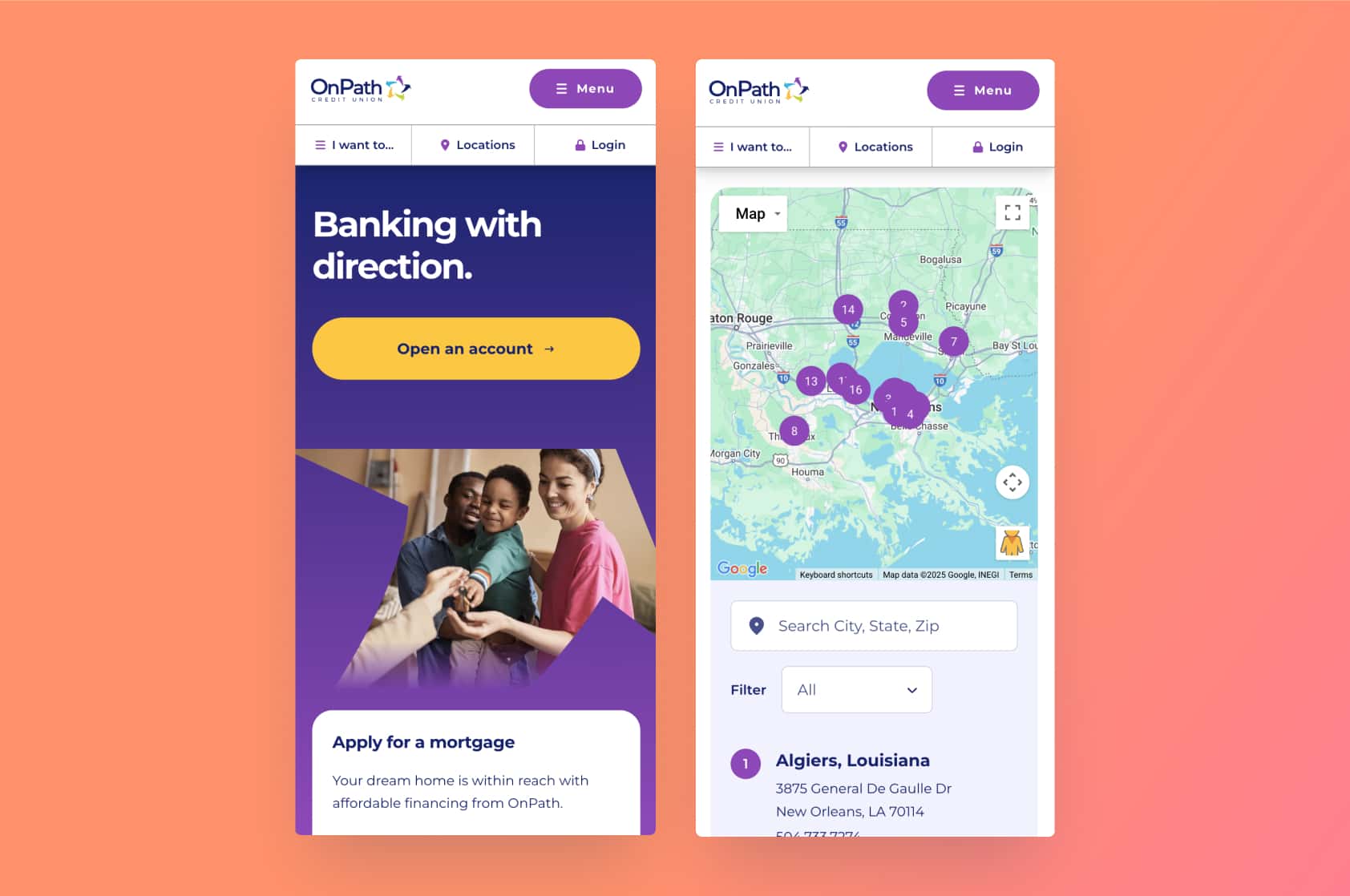
1. intuitive navigation & menu
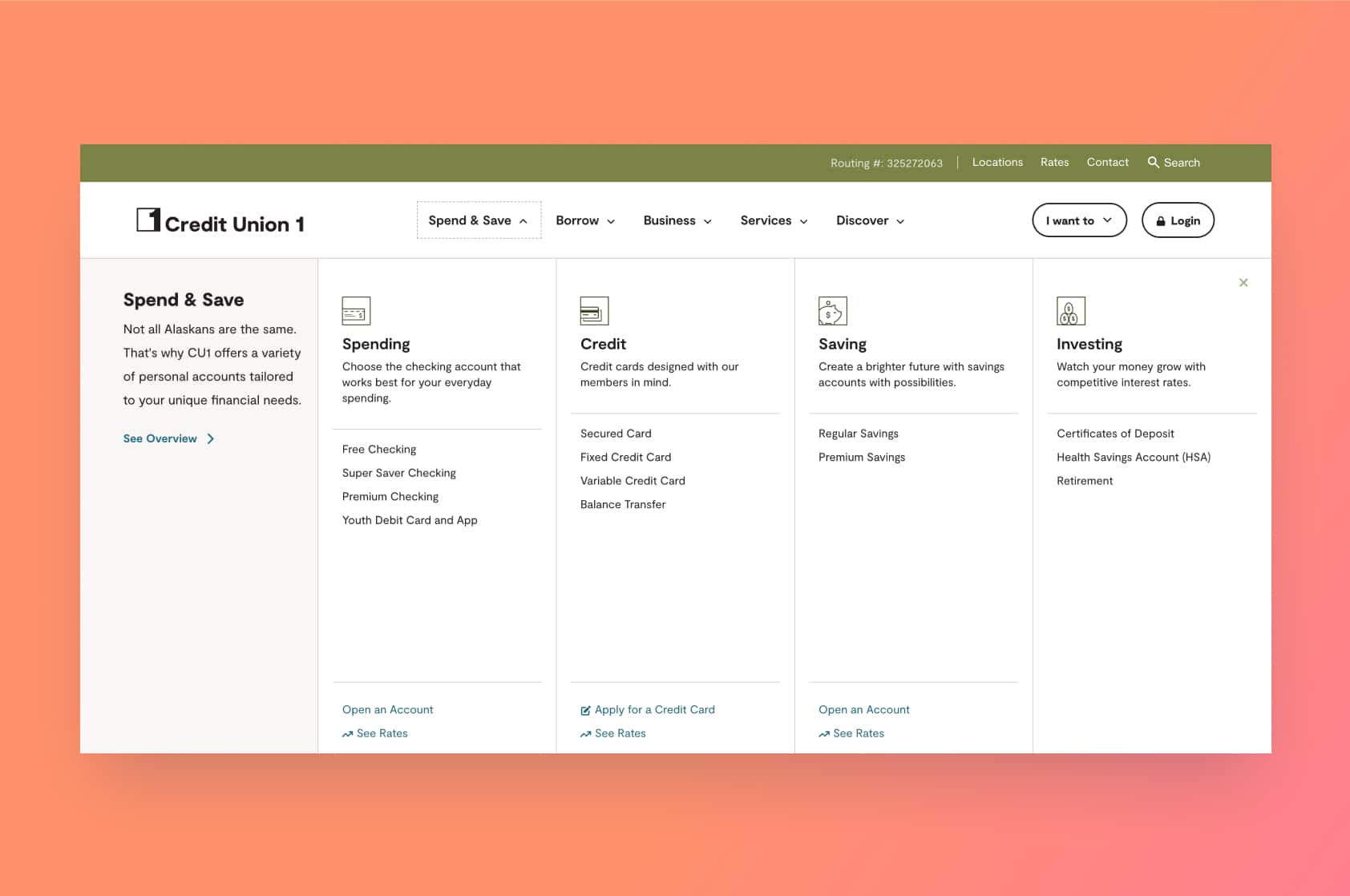
Ever landed on a website and felt instantly lost, like walking into a maze without a map? Your homepage’s navigation should be like a well-lit roadmap—members should never feel stranded.
For credit unions, intuitive navigation is crucial. Members typically visit your site with a specific task in mind: checking balances, viewing auto loan rates, or finding a nearby ATM. If your menu is confusing, visitors won't stick around.
Design your main menu clearly around top tasks. Stick to 5–7 menu items labeled simply, such as “Accounts,” “Loans,” and “Locations.”
Skip industry jargon and use everyday language—say "Car Loans" instead of "Consumer Vehicle Financing." Highlight popular tasks prominently, like login access and ATM locations.
Most visitors quickly log in and leave, which limits exploration. Intuitive navigation can draw them further into your site.
Also, include an easy-to-find search bar and key details like phone numbers and branch locations visibly in the header or footer.
The bottom line: clear navigation boosts satisfaction, trust, and deeper engagement.
2. Prominent online banking login
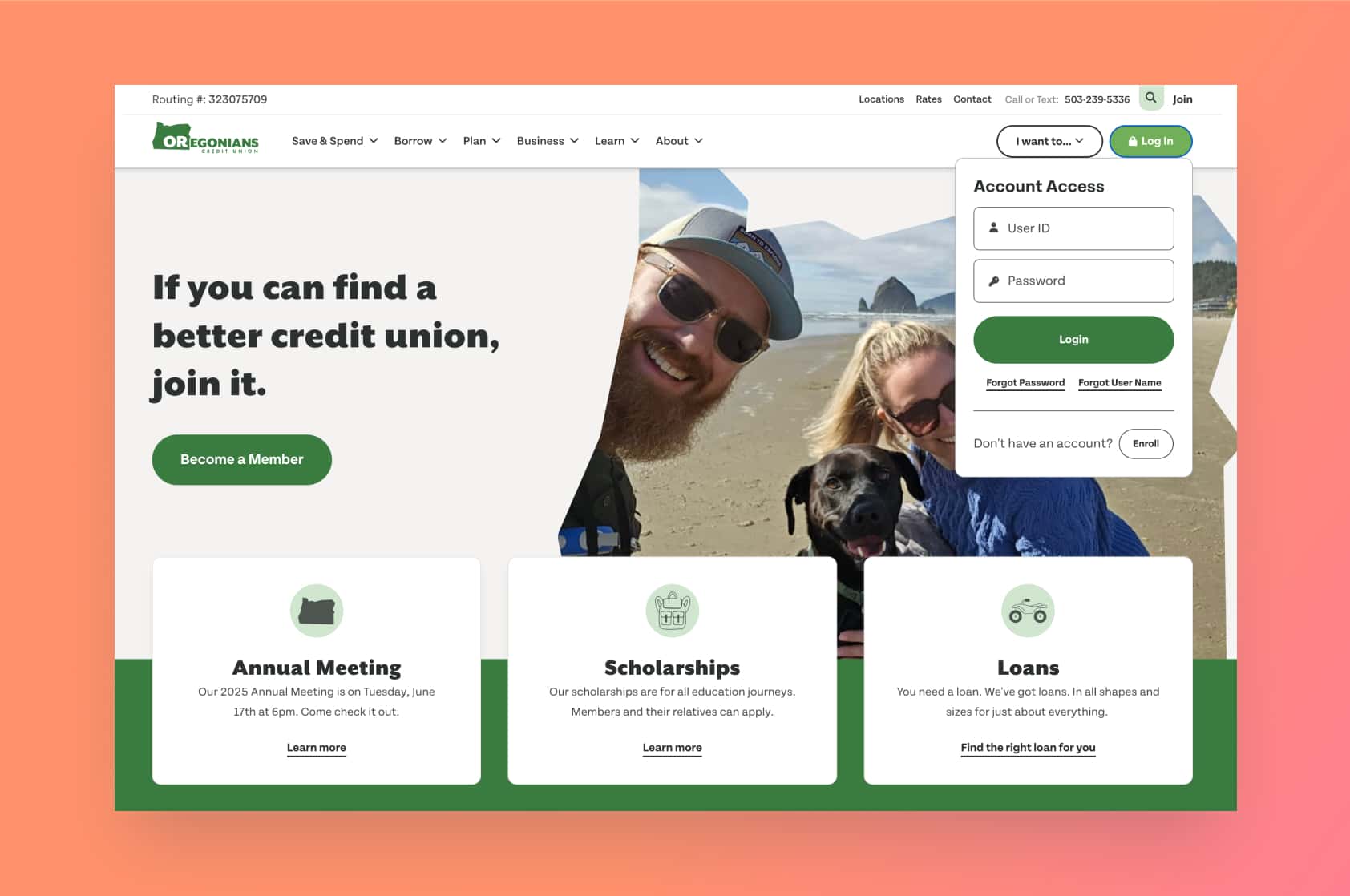
People don’t visit their bank’s website casually—they’re there with a purpose, often logging into online banking.
For many credit unions, the login button is the homepage’s most-clicked feature. So don’t bury it in menus—place it clearly at the top-right, visible without scrolling.
Consider adding Single Sign-On (SSO), allowing members easy and secure homepage login, improving user convenience.
Well-positioned login areas can also highlight other offerings subtly, like low-rate loans or special promotions.
Make your login prominent and secure-looking, ideally with a padlock icon. If logging in is effortless, members feel happier and more likely to engage further.
Keep login easy on desktop and especially mobile—clear, large buttons enhance user experience.
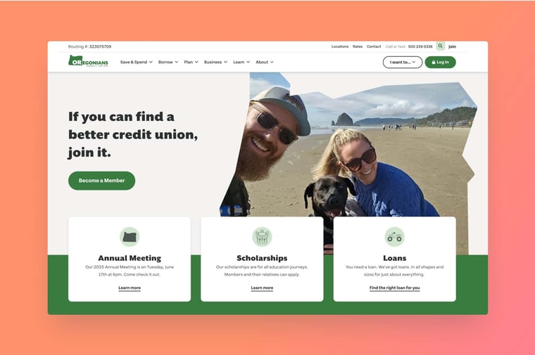
3. Clear value proposition in a your hero section
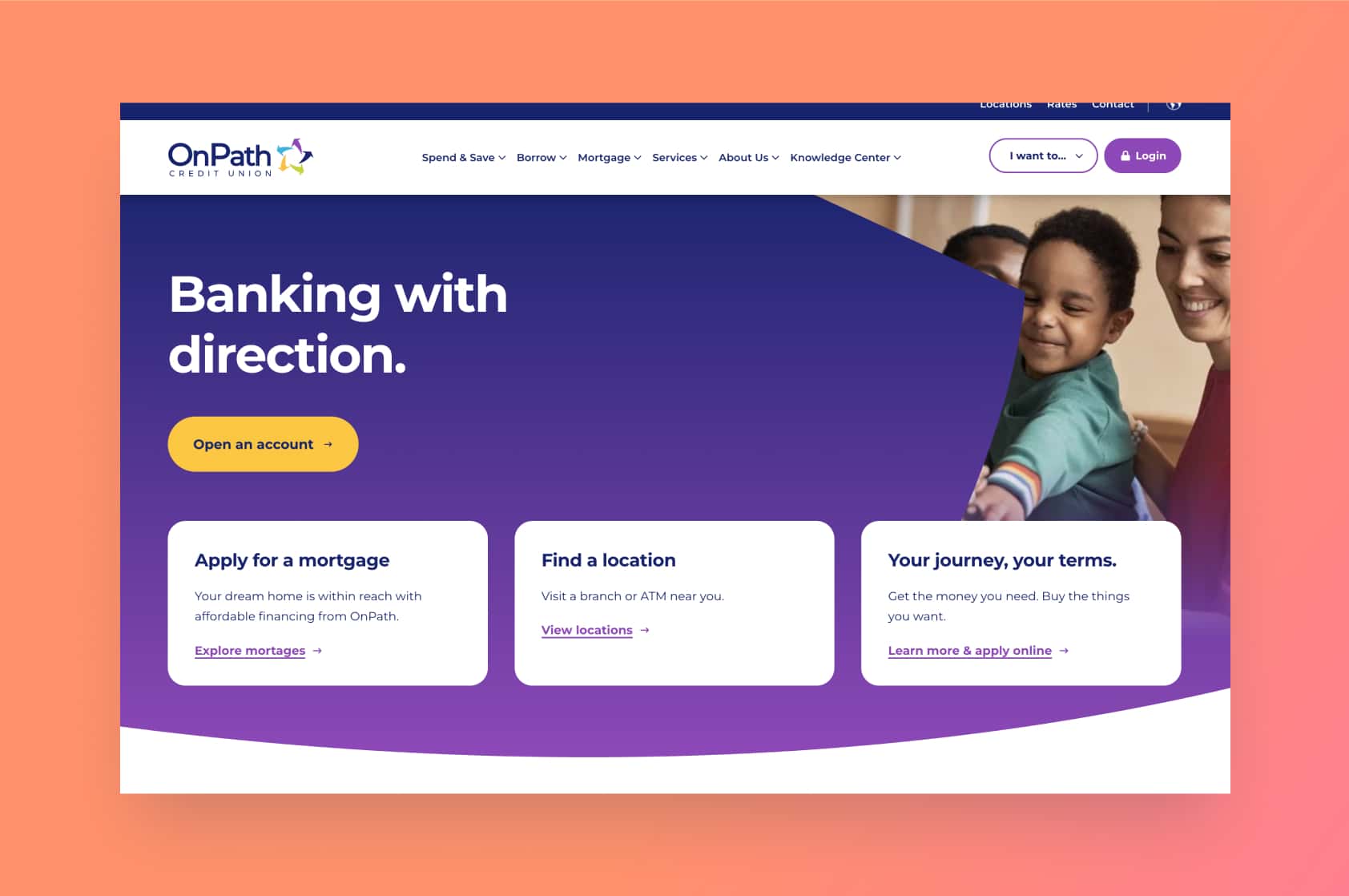
First impressions online happen in seconds. Your homepage’s hero section—the banner area—should clearly and immediately communicate your core value proposition. Think of it as your digital handshake.
Use specific, member-focused language instead of vague welcomes.
For example: “Banking Made Simple, With People Who Care – Serving Springfield Since 1950.” Pair your message with engaging visuals relevant to your audience.
Include a bold, actionable Call-to-Action (CTA), like "Join Now" or "Learn More," prominently in the hero area. Clear CTAs boost conversions significantly.
Remember, your hero section must quickly answer, "What’s in it for me?" A compelling value proposition makes visitors feel understood, setting the stage for deeper engagement.
4. Strong calls-to-action & member-focused content highlights
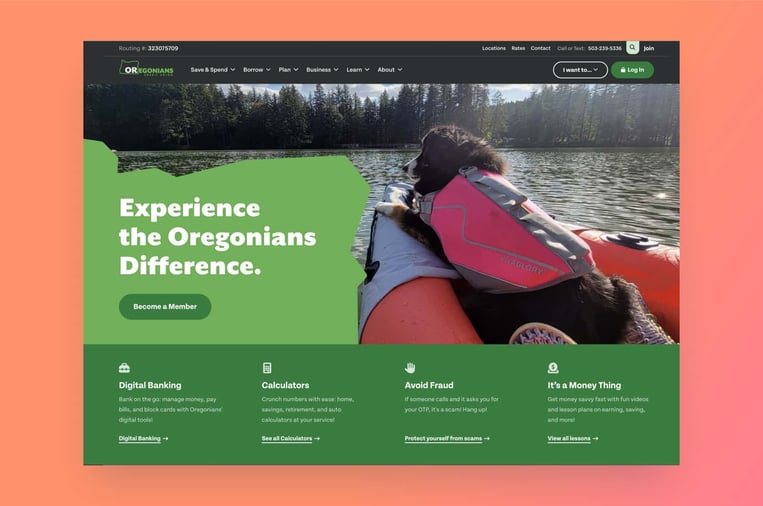
After engaging visitors initially, guide them further with clear, strategically placed CTAs.
Your homepage should offer both direct actions (“Open an Account,” “Schedule a Consultation”) and indirect options (“Sign Up for a Webinar,” “View Rates"). Both types encourage exploration and cater to various visitor readiness levels.
Highlight key products or services below your hero section, like promotions or community events. Use visually distinct panels or buttons to help users quickly identify and select actions.
Personalize these sections if possible, as tailored content significantly boosts engagement.
Clear, action-oriented language (“Join Today”) ensures visitors always know their next step.
The bottom line: well-designed CTAs and relevant content highlights not only inform but actively guide visitors toward deeper interaction and conversion.
5. Mobile-friendly & accessible design
If your site isn’t mobile-friendly, you're excluding more than half your potential visitors. Over 50% of web traffic now comes from mobile, with nearly 80% of digital time spent on smartphones.
A mobile-friendly, responsive homepage design is essential. Ensure readability without zooming, easily tappable buttons, and prioritized content for mobile devices.
Accessibility is equally vital. Your site must meet basic WCAG guidelines—clear contrast, descriptive alt-text, and keyboard navigability—to include everyone, regardless of disability.
A fast-loading, accessible site not only serves all visitors but improves overall satisfaction and search engine rankings.
The takeaway: mobile-friendly and accessible design are no longer optional; they're crucial to user satisfaction and digital success.
6. Fast loading speed & solid security

Speed and security might be invisible, but they're foundational to user experience. Slow load times lead to quick visitor exits, with bounce rates jumping 32% when load times increase from 1 to 5 seconds.
Optimize your homepage by compressing images, enabling caching, and using efficient coding. Tools like Google PageSpeed Insights help identify areas for improvement. Fast-loading sites reflect efficiency and build trust.
Security is equally critical, especially for financial sites. Use HTTPS, prominently display security badges, and reassure users about their data privacy and security.
Highlighting trust indicators like NCUA insurance or security reminders can greatly enhance visitor confidence.
The bottom line: investing in speed and security establishes trust, enhances credibility, and ultimately increases digital engagement and conversions.
Regularly review and optimize both to maintain user confidence and satisfaction.
Ready to transform your credit union's homepage?
We've covered the essential elements that turn your credit union homepage from outdated and frustrating to engaging and effective.
With intuitive navigation, a prominent login, clear messaging, strategic CTAs, mobile-friendly design, and robust security, you now have a roadmap to create a homepage that genuinely serves and delights your members.
The value here is clear: a better homepage doesn’t just look good—it actively boosts engagement, member satisfaction, and growth.
By focusing on what truly matters to your members, you're building trust and loyalty from the very first click.
At media junction, we've seen firsthand how transformative these principles can be. With 25+ years of web design experience and our status as an elite HubSpot partner, we've helped many credit unions achieve measurable improvements in engagement and conversions.
Now it's your turn. Evaluate your current homepage against these six must-haves. Identify your strengths and uncover opportunities to improve.
Feeling ready for a change or want expert guidance? Schedule some time with our team at media junction. We specialize in credit union website redesigns, and we'd love to discuss how we can help turn your homepage into your greatest asset.


